Creating clarity when priorities kept changing
Designing a high-volume government payment service under tight delivery constraints.
Impact
- 3,526
- Claims submitted in first month
- £591K
- Paid to FE teachers in first payroll
Context
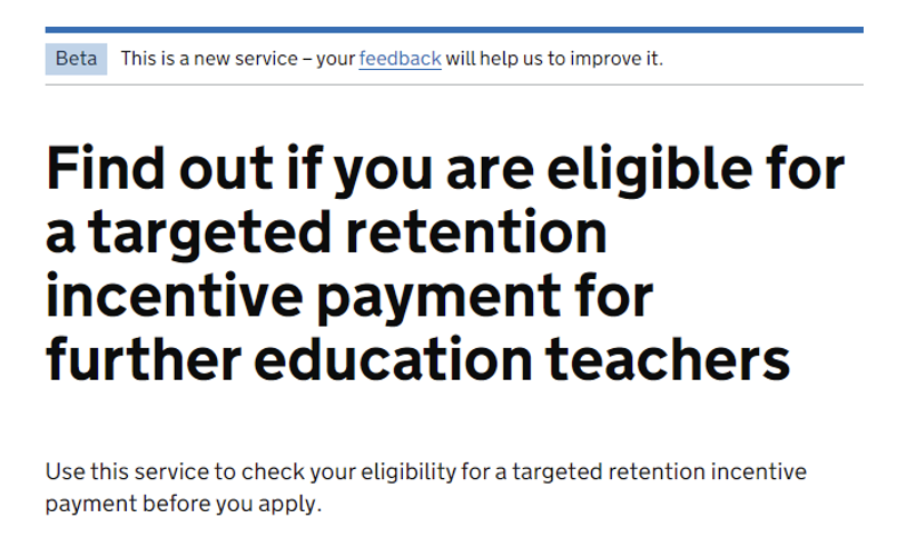
I designed the end-to-end claims journey for a Department for Education service supporting targeted retention incentive payments for further education teachers.
The project involved multiple user groups, complex policy requirements and a tight delivery timeline. As we moved towards private and public beta, the biggest risk wasn't individual screens - it was uncertainty about scope, remaining design work and what could realistically be delivered.
I took the initiative to create a design roadmap and capacity view so the team could visualise the remaining work, communicate constraints and set more realistic expectations with the client.
The challenge
Eligible further education teachers needed a way to claim targeted retention incentive payments, while providers and DfE administrators needed to verify and process those claims.
That meant designing for high volume, translating complex policy into a clear journey, and working across policy, content, delivery and development dependencies - all towards a fixed go-live date.
By the time we approached beta, the hard problem had shifted from “what should this screen look like?” to “what still needs to be done, and what can we actually deliver?”
Creating clarity when priorities kept changing
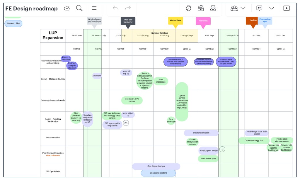
By the end of June, we didn't have a clear view of remaining design and delivery tasks. That made it hard to answer basic questions: what was essential for MVP, what could wait, and how much design capacity we had left.
Requirements were still changing. The DfE admin service had been descoped from MVP, then brought back in mid-July, relatively close to private beta. What was initially treated as small work ultimately took more than three sprints.
Rather than waiting for a complete project plan, I created a design roadmap with the content designer - mapping remaining tasks, estimated effort, dependencies, MVP priorities and where new requirements would affect capacity.
That changed the conversation. Instead of saying “we're running out of time,” we could show the work remaining, available capacity and the trade-offs involved. It turned a subjective concern into a structured discussion about scope and priorities, and gave the client clearer visibility of progress.
Visibility mattered elsewhere too. Policy conversations sometimes happened without the digital team, and on one occasion significant design feedback sat with the delivery manager for around four weeks before reaching design. I treated that as a delivery risk - surfacing feedback, dependencies and constraints through design crits, developer catch-ups and a weekly design check-in so concerns could be raised early as part of responsible delivery.
Designing under constraints
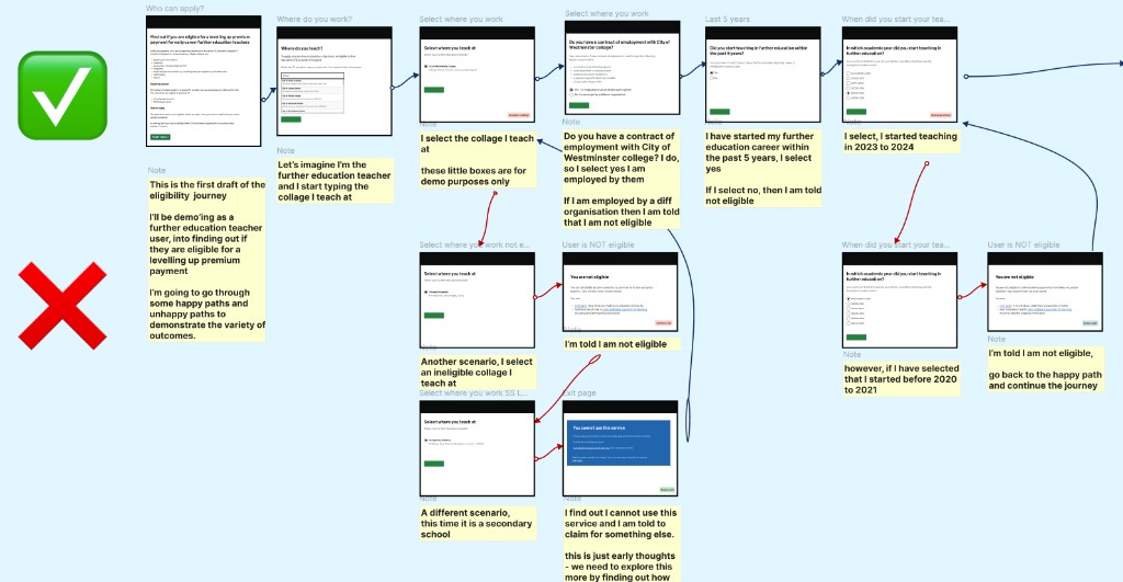
With a short runway to go-live, we couldn't run a long research-design-test cycle for every problem. I reused established GOV.UK patterns wherever possible, and focused bespoke design effort where the service genuinely needed it.
That reduced design and development effort, kept the service consistent with GOV.UK, and helped limit avoidable usability issues after launch.
Not every constraint was ours to solve. After the General Election, the service name changed to a long, ministerial-level title that didn't align well with GOV.UK naming guidance. We raised the risk and suggested clearer alternatives, but the final decision sat outside our influence - a reminder that good design also means knowing when to recommend, document the risk, and move on.
Documentation was another pressure point. Rationale lived across Figma, Lucid and project spaces, and under delivery pressure it was easy to deprioritise. During beta assessment we were asked about working in the open and design histories - an area we could have handled better. Before leaving the project, we created design history entries for claimants and providers. Next time, I'd establish that much earlier.
The outcome
The service launched on GOV.UK and supported a high volume of claims with a familiar government experience.
Most importantly, the roadmap gave the team a clearer view of delivery and better conversations about capacity, scope and prioritisation.

What I learned
Designers can create structure, not just screens
Taking ownership of delivery visibility can be as valuable as solving interaction problems.
Make capacity visible
Showing the work, effort, dependencies and available capacity makes prioritisation conversations objective.
Raise risks early - and document them
Lightweight design history protects rationale and makes future iteration easier.
Design leadership isn't always about authority
I couldn't control scope or timeline, but I could influence how the design team responded - through the roadmap, facilitation and raising risks clearly.