Making complex information easier to manage
Designing a simpler way to manage changing financial arrangements throughout their lifecycle.
“I'm impressed with how quickly Siddiqah produces her designs, and also how adaptable she is to changing requirements and priorities. She also frequently offers alternate, improved suggestions. She is well-versed in GDS standards ensuring that the designs remain compliant.”
Context
UK Export Finance (UKEF) provides guarantees that allow businesses to access finance while sharing some of the financial risk with other insurers. For example, if UKEF guarantees an £80m loan, another insurer may take on part of that risk. In some cases, that insurer may only cover the facility for part of its lifetime, meaning the amount of risk and repayments they are responsible for can change over time.
This created a design challenge: how could we help users clearly understand and manage these changing relationships when creating a facility and throughout its lifecycle?
The problem
UKEF underwriters were managing complex financial data - including who shares risk, how fees are calculated and how repayments are scheduled - through processes that didn't fully reflect how this work happens in practice.
Constraints
The service needed to support this complexity while meeting government design standards. However, there was no established UKEF-specific design foundation to build from, and the underlying data structures and user needs differed significantly from typical government services. I was also working within tight sprint timelines and a steep domain-learning curve.
The existing process relied heavily on users manually connecting related pieces of information across notes, documents and spreadsheets. This created opportunities for information to become disconnected and placed additional cognitive load on underwriters. The design opportunity was therefore not simply to digitise the existing process, but to make those relationships explicit within the service.
My role
I was responsible for defining and validating the proposed user journey across both the creation and in-life journeys. I worked closely with the SME to understand the domain and mapped the proposed flow before taking it back to the wider team, including developers and BAs, to test whether the approach was workable. I then validated the proposed journey with users to understand whether it reflected how they would actually manage reinsurance throughout the facility lifecycle, including less common in-life scenarios.
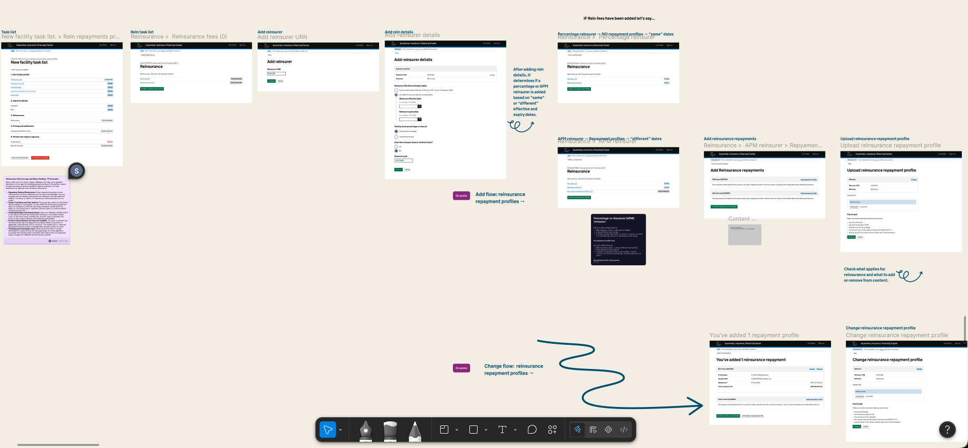
Initially, the user flow looked like this
 (opens in a new tab)
Facility task list → Reinsurer selected → Reinsurance task list → APM reinsurer → New repayment task appears → user completes task
The key design question became: Should repayments remain a separate task, or should they become part of the reinsurer itself?
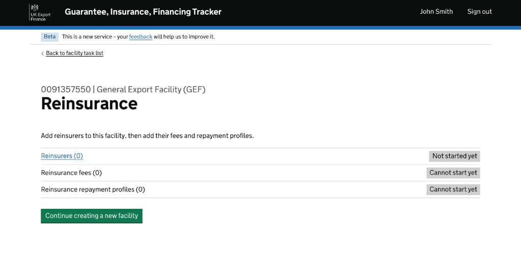
The separate task list created a gap
The problem was: The task only appeared in certain circumstances, but there was no clear way for the user to understand that a new task had been created.
And even worse: The outstanding task could prevent the user from reviewing the facility.
Research showed the scenario was more likely to occur during the in-life journey, but we needed to ensure the creation journey could accommodate it where appropriate.
We considered option A and B
Option A - Keep the separate task list
Pros
- Keeps repayment work separate
- Fits the original concept
Problems
- Introduces another place for users to look
- Creates a status/visibility problem
- Users may not understand why a new task exists
- Could prevent them from reviewing the facility
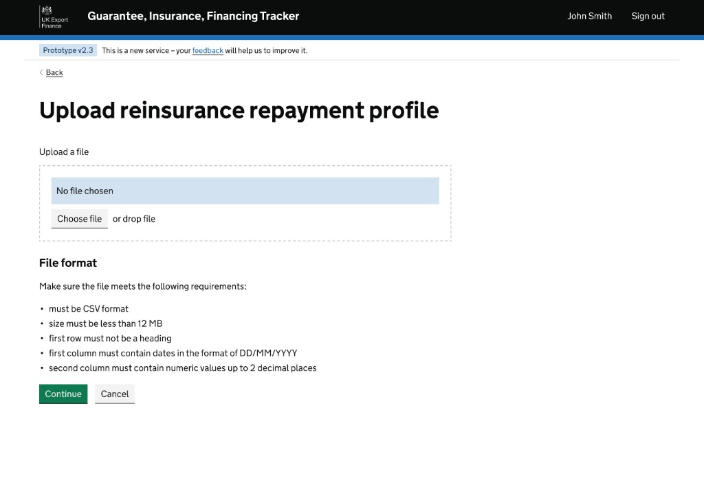
Option B - Bring the repayment information together with the reinsurer details
Pros
- Creates a direct relationship between reinsurer and repayment profile
- Reduces the need to cross-reference separate areas
- Removes the separate task-list dependency
- Simplifies the status model
I recommended Option B because the reinsurer and their repayment profile are intrinsically related pieces of information and we aligned on this approach with the SME, developers and wider team.
Why? Keeping them together reduced the need for users to connect information across separate areas of the service.
Design principle: If users are already doing the work of grouping information themselves, the service should do that work for them wherever possible.
Outcome
- Validated the proposed interaction model with users
- Aligned SMEs, developers and BAs around the design direction
- Closed the design gap created by the separate reinsurance repayment task list
- Simplified how reinsurer details and repayment profiles are represented
- Design was agreed and progressed into MVP build
- Subsequent user feedback specifically informed the in-life journey
“It's been easy to build from your figma designs, I like how you use icons and text elements to annotate / add context. It's easy to discover designs as well as they are well organised in different pages in same figma file with clear names and epic/feature numbers.”
What I learned
Internal users often develop their own ways of grouping and cross-referencing information when working across notes, spreadsheets and other offline tools. A good digital service shouldn't simply replicate that process. It should do more of the cognitive work for the user by bringing related information together and making those relationships explicit.
This reinforced for me that simplifying an interaction isn't always about reducing the number of steps - sometimes it's about reducing the amount of mental effort required to connect information.
Working within MVP constraints
One of the biggest challenges was balancing the ideal user experience against what could realistically be delivered within the MVP.
I learned that simplifying the experience isn't necessarily about removing functionality. In this case, stripping back unnecessary complexity and aligning the underlying logic made the design easier for developers to build while keeping the core user need intact.
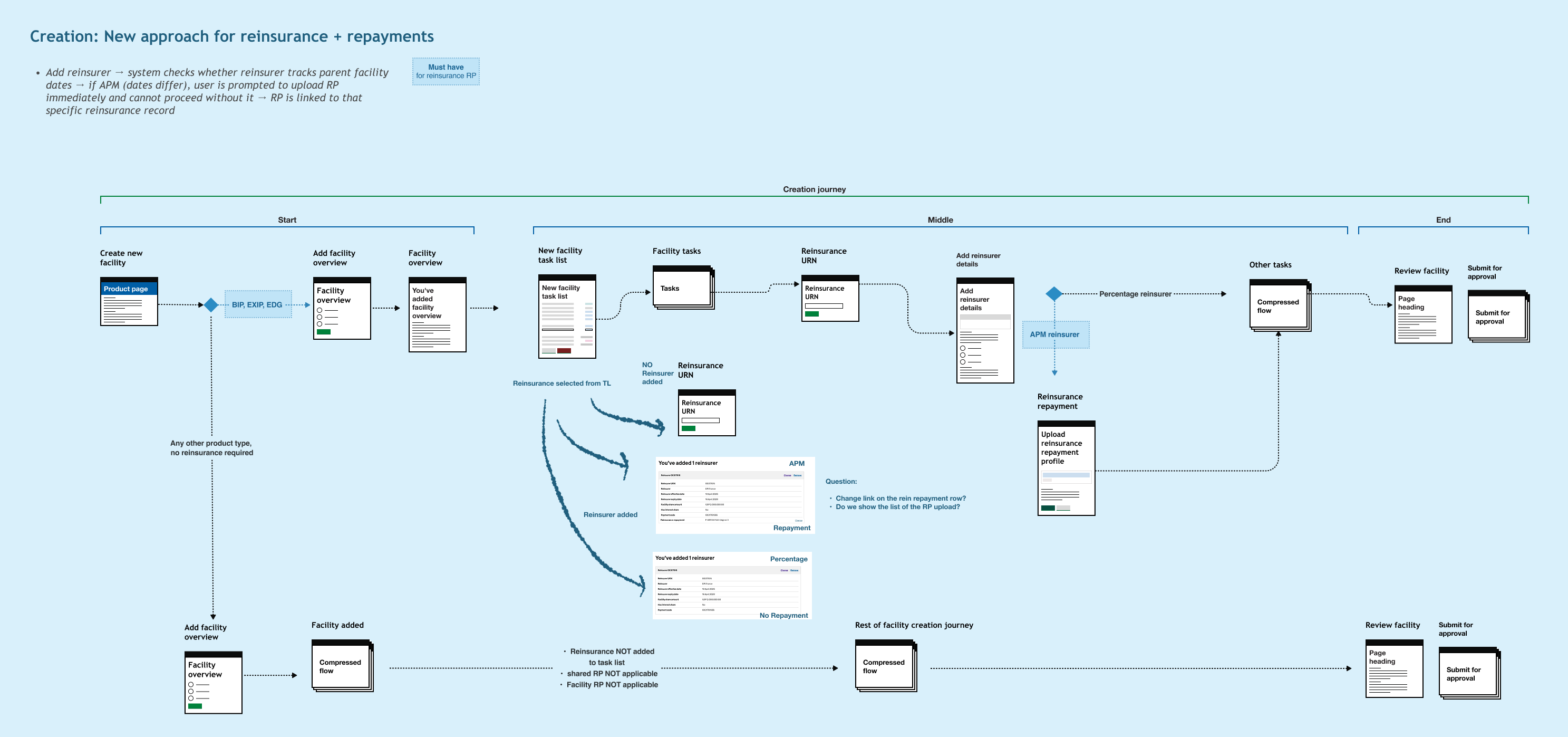
Creation
In-life
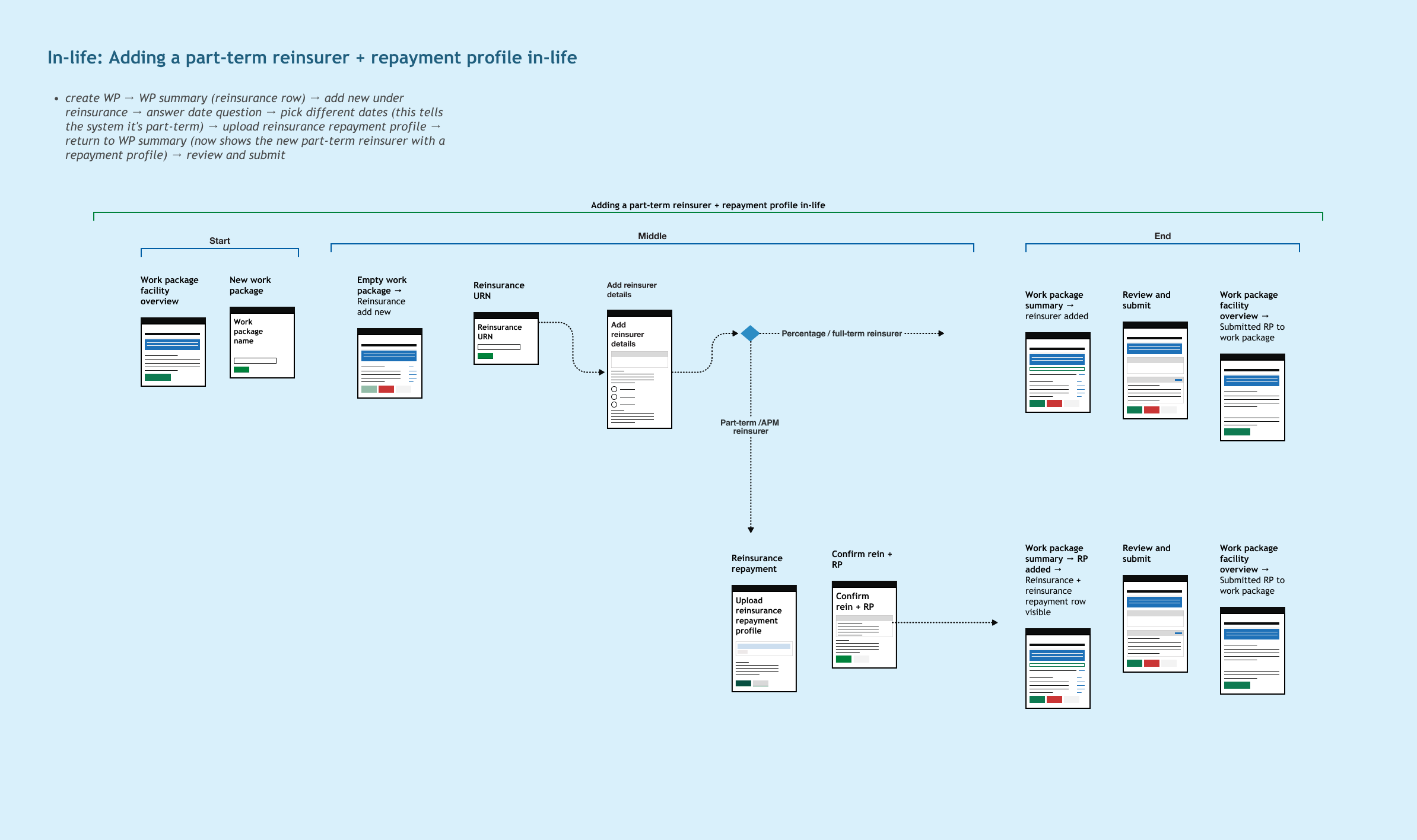
What this means for the latest design journey
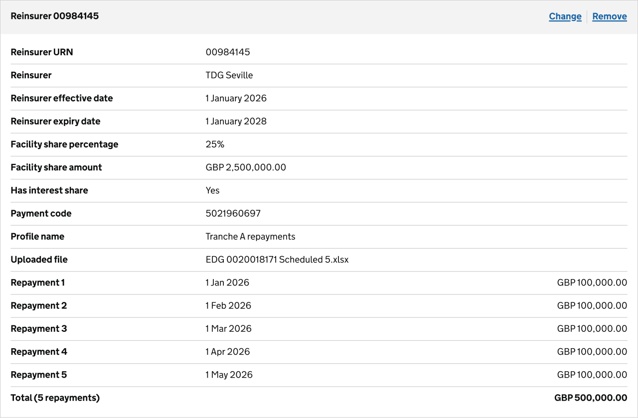
We combined the information into a single summary card, creating a clearer relationship between the reinsurer and the associated repayments. This also removed the need for a separate reinsurance task list and simplified the status model.
 (opens in a new tab)